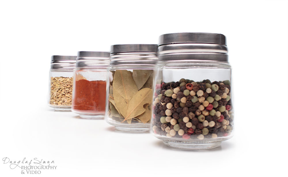
Product on a white background has become the standard for product images. Whether to use a full shadow, or slight shadow, or no shadow is the next question. But when you’re ready to show off your product creativity opens a fabulous door. The above photo of spice jars keeps three of the four jars in focus, with a slight out of focus on the third jar, for a subtle statement.
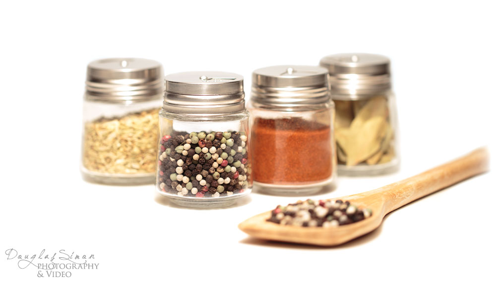
The next photo is a lovely simple composition, still on white for an open, floating feeling, adding the spoon for a touch of lifestyle. A subtle product styling idea.

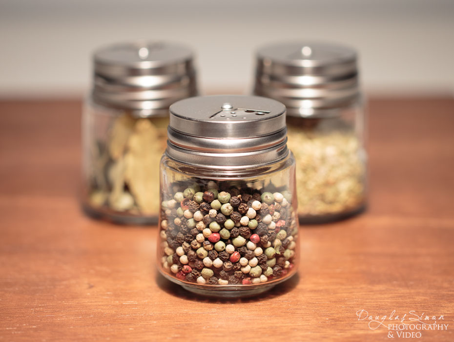
Still keeping the product styling simple we’ve added an organic feel using wood for the presentation. These are only a few ways to style your product. Keep your own product as an alternative to stock photography for your website.

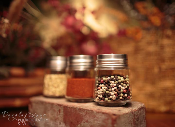
Finally adding a full background frames the jars using a brick for strong base statement. The first jar has the strength and focus, allowing the other jars to become part of the background. You get the idea of the vast possibilities when you’re ready to take bring your product front and center in your website and promotion.

