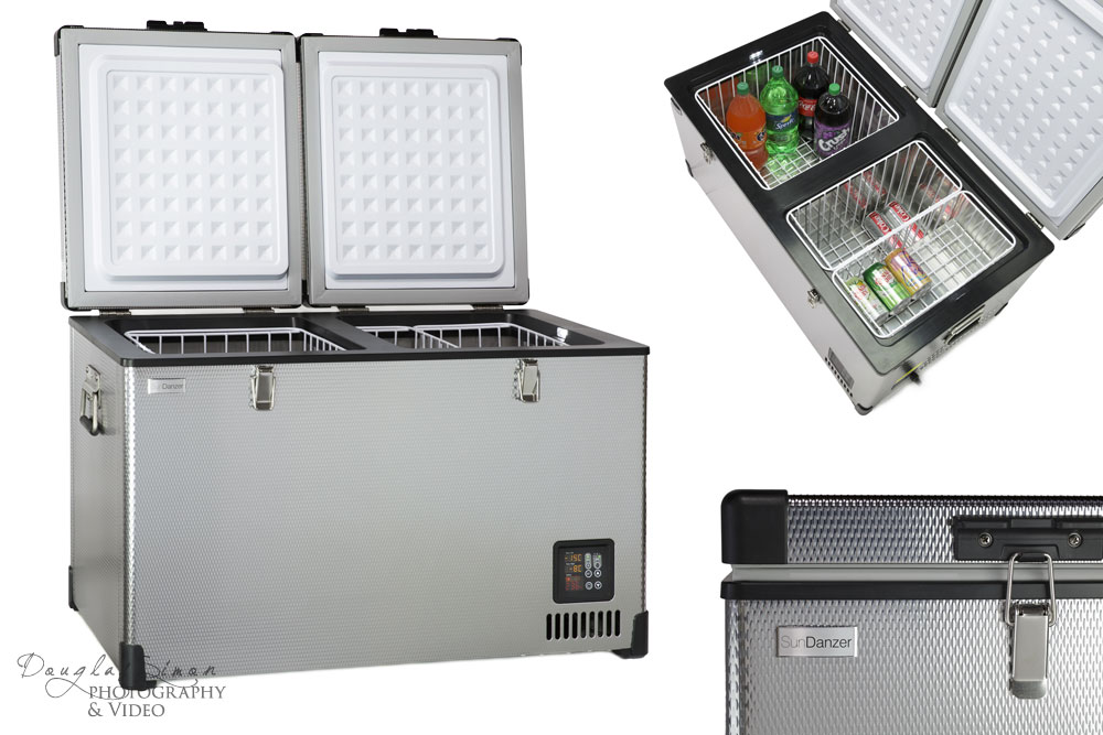
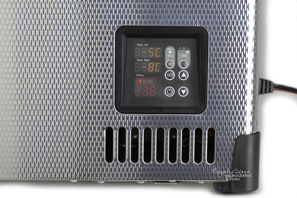
Some products are just gorgeous due to their exterior surface. This diamond pattern is lovely! The reflective nature is the tough part about photographing this product. Our client is launching a new product line with two sizes of this unit. They also wanted to show the quality of craftsmanship, details and a product styled use image.
Product styling always sounds simple: Grab some items and stack them inside. The last thing you want for your product is distraction from the unit. In this case we discussed colors of soda, lid options, choice of cans, what to put on the top rack, position of the labels and making sure everything was “balanced” to the eye–and keep these items from moving/rolling. Attention to detail pays off in a well laid out composition and the product “shines”. In this case–it always shines!
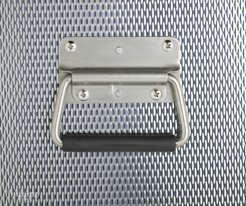
Reflective products (glass, metal, jewelry, high gloss acrylic products) offer challenges. Once the lighting is in place-then you begin to block out reflections you don’t want – inclusive of the photographer in the product. Controlling the light to not blow out the high reflection, yet show off that very shiny surface we all love. The diamond metal pattern here controlled some of the typical hot spots. We were also able to make use of massive overhead natural lighting and several white reflectors to obtain an even product surface look. Working all of the elements together takes a lot of time. We spend more time setting up a shot, than shooting, typically. Shooting multiple angles meant repositioning everything (continuous lighting, white reflectors, c-stands, every clothes pin and re-taping) with each change of angle, and the second unit.
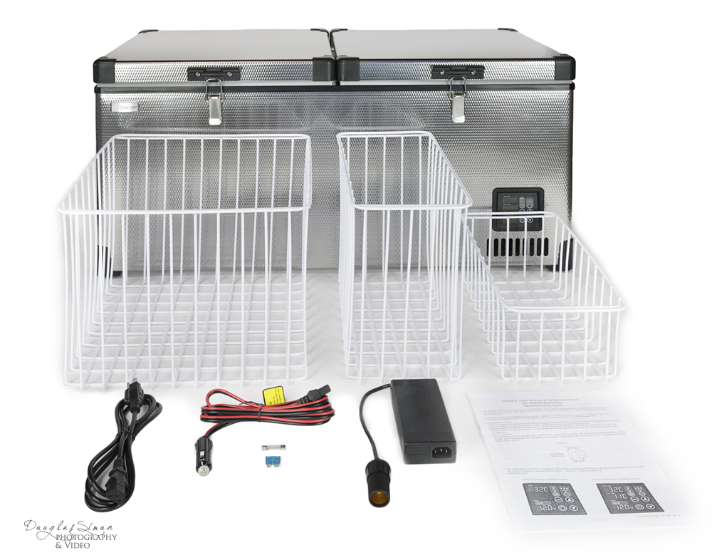
When you’re selling online any product photography should include an all-the-parts shot, manuals included. Let prospective clients know what’s in the box. We’ve also been asked to edit the photos adding the dimensions for clients. Make it easy for people to buy your product!
Continuous Lighting
Natural Lighting
White Reflectors
Canon 24-70mm 2.8 Lens
Canon 100mm 2.8 Macro Lens

